1. Holding a shot steady where appropriate - we do this several times when we shows the entire band playing and get the entire stage into the shot, the first five seconds of the music video is a good example of this, the long steady shot show's the band opening on a stage.
2. Framing a shot including and excluding elements - shot 1 below is well framed because it shows our singer performing his song excluding any other elements of the music video because that's what we wanted for this shot. Shot 2 which is also below shows us the band but at a earlier stage of the day where they are rehearsing as we can see that they are not dressed to perform and they are standing on and off the stage, this is what we wanted the shot to be framed like.
1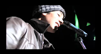
2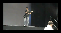
3. Using a variety of shot distances - we do have a variety of shot distances in our music video, for example at 0:01 we have a long shot, at 0:23 we have a close up on the guitars being played, at 0:32 we have a close up of the singer, there is a medium close up at 0:38, at 2:38 we have a extreme close up of the singer, we also have a medium shot at 1:05 of the drummer.
4. Shooting material appropriate to the task - I believe that the shooting material is apropriate for the music video, for example our genre is pop-rock and our performers are all dressed in the way that a real pop-rock band would dress. Also we have fast cuts to the beat which can also be associated with the pop-rock genre
5. Selecting mise en scene - I believe that the location which is the stage showing the live performance of the band is a good example of selecting the mise en scene, also our performers all wear similar types of clothes to fit the genre of the music video which also fits the genre of pop-rock.
6. Editing so that the videos meaning is apparent - an example of editing we have used to show the video's meaning would be the fast cuts to the beat in the video showing the bands performance.
7. Using varied shot transitions - we did not use any transitions because we believed that it was more appropriate for the video to use straight cuts. The transitions we believe would not of gone well with the video.
8. Using sound with images - we have used well put together lip syncing throughout the video every word should match with the song and singer. We have also used a lot of thought beats through the video which make the video more entertaining to watch. We have also used guitars and drums which we also believe we have matched up pretty well for the music and the instruments.


